Designers from San Francisco did a great job for the Study conductor Finder in OS X for power user friendliness and offered his own version of design that meets modern standards of user interfaces. We are talking about a standard component of the conductor operating system Apple, displays the properties files.

"Anyone who has had to work on Mac OS X, aware of the problem. You select multiple files, do a right click, open the menu and click on the button "Properties" ... After that, even zealous evangelists begin to hate Apple Mac OS. When it happened to us once again, we decided that it was time to change. "
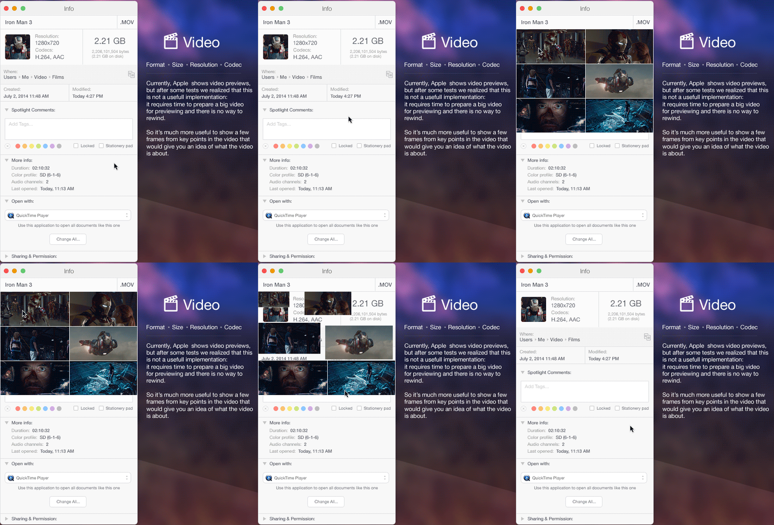
Designers have updated the design of the properties window, optimized layout and divided them into groups. So, for photos and screenshots window displays the format, size, resolution, and color space. For music files relevant format, size, bit rate and duration for the video - the format, size, resolution and codec. And, of course, when you select multiple files, OS X does not display dozens of windows, and shows one window with a count of the number of selected files and their total size.

The new design of the properties window for OS X Yosemite

The properties window of the film / video

The properties window of an audio file

Window property photos

Properties window when you select multiple files